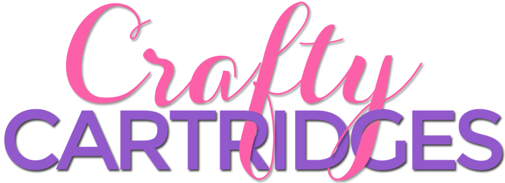
I’m excited to reveal the logo I created for my client’s website. What I love about this is how the letters are intertwined from the top title into the bottom title. I also had to customize the shadows to make it look more realistic. And for those of you wondering, this was done in Photoshop.
Let me know what you think!
Next up I will reveal the website and show you some of the cool features included with it!

